Annual Patient Experience Survey
We developed an online survey and reporting system for 20 Family Health Teams in the Champlain Region (Ottawa and surrounding areas). We were able to collect thousands of survey responses and report on the data automatically as the responses came in.
My Role
- Survey layout and design
- Report layout and design
- Front-end development
Skills & Technologies
- HTML
- CSS
- JavaScript
- Highcharts
- SurveyJS
- React
- Bootstrap
- Accessibility
Scenario
Our team was contracted to design and develop a new survey administration and reporting system for Family Health Teams (FHT) in the Ottawa area. Each FHT would have their own survey link to distribute to their patient roster, and following the survey each FHT would get a set of reports detailing their survey results.Survey Design
The survey is being distributed across the entire population of patients at many Family Health Teams. As such, survey respondents could be anyone, using any kind of device. This made it important to make sure that the survey would be both accessible, and adaptable to a variety of devices.
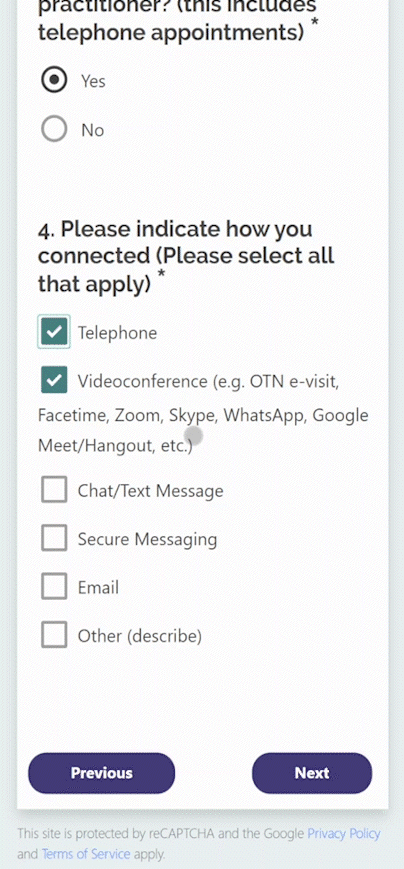
The previous Patient Experience Survey did not have any styling, and could be difficult to complete on mobile devices. We created a new online survey by using SurveyJS, React, and Bootstrap. I used one of the themes available in SurveyJS, and modified it to be consistent with the Ontario Family Health Teams colours.
Improvements and design considerations:
- Ensured that colour contrast ratios met, or exceeded, the minimums for Level AA WCAG 2 requirements.
- Ensured that the page content could be scaled up to 200% without loss of content or functionality (meets WCAG 2.0 requirements).
- Responsive design for functionality across a wide range of devices.
- Larger radio and checkboxes for easier use on a touch screen.
- Larger text sizes provide a more comfortable reading experience for many users.
- Pagination was added to reduce the need for scrolling. The survey is 19 questions in length and an answer is required for almost every question; so, without pagination, if a user were to miss answering one of the questions, they would likely have to do significant extra scrolling to get back to the submit button.
I also tested the survey using ChromeVox (screen reader from chrome) and was able to navigate the survey questions.
The old Patient Experience Survey
.png)

The new Patient Experience Survey
.png)
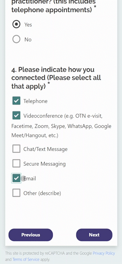
While testing the survey on mobile devices, I noticed that the behaviour of the checkboxes was confusing. If a user on a touch device were to try to uncheck an item, the checked item would turn from green to grey, making it appear like maybe it was still checked. The SurveyJS theme that we were using was like this by default, so we overrode their on hover styles to remove the grey checkbox that was appearing when deselecting a checkbox on a touch screen.
When trying to deselect a checkbox on a touch screen, the checkmark would change to a grey checkmark, making it difficult for the user to know if the box was checked or unchecked.
We changed the checkbox behaviour for touch devices so that the checkbox would completely disappear, making it clear to users that the selection had been removed.
Dashboard and Reporting
The next deliverable for this project was a redesigned report. Previously, the report was made in Excel and Word, and could be difficult to understand and extract meaning from. Organizations were provided with a comparative report, where they could see the scores for all of the organizations side-by-side. In addition, for organizations that chose the option, there was a report that showed scores for each healthcare provider individually.
We decided that, given the complexity and quantity of reports that would have to be generated, the reporting would be done in a web-based system.
The users of the reporting system would be made up of a representative from each of the 20 Family Health Teams (Executive Directors, as well as other FHT staff), along with 2 Quality Improvement Decision Support Specialists (QIDSS). Users representing an FHT would have access to their own report, while the QIDSS users would have access to all team’s survey data.
I started by talking with an Executive Director, as well as a Director of Patient services to determine what they thought should be included in the reports. They both had different views on this. One thought that a report comparing the different teams was most useful, since that would allow him to see how his organization compared to others. Making the comparison and knowing how some organizations are funded differently, or have different resources, would help him to see where his team could improve, and collaborate with teams that were doing better. The other thought that the report that just showed the team’s own scores was the best way to see areas in need of improvement.
Using the Highcharts JavaScript charting library, and Bootstrap, I developed report templates for a comparative report, a clinic-level report, and a provider-level report.
Comparative Report
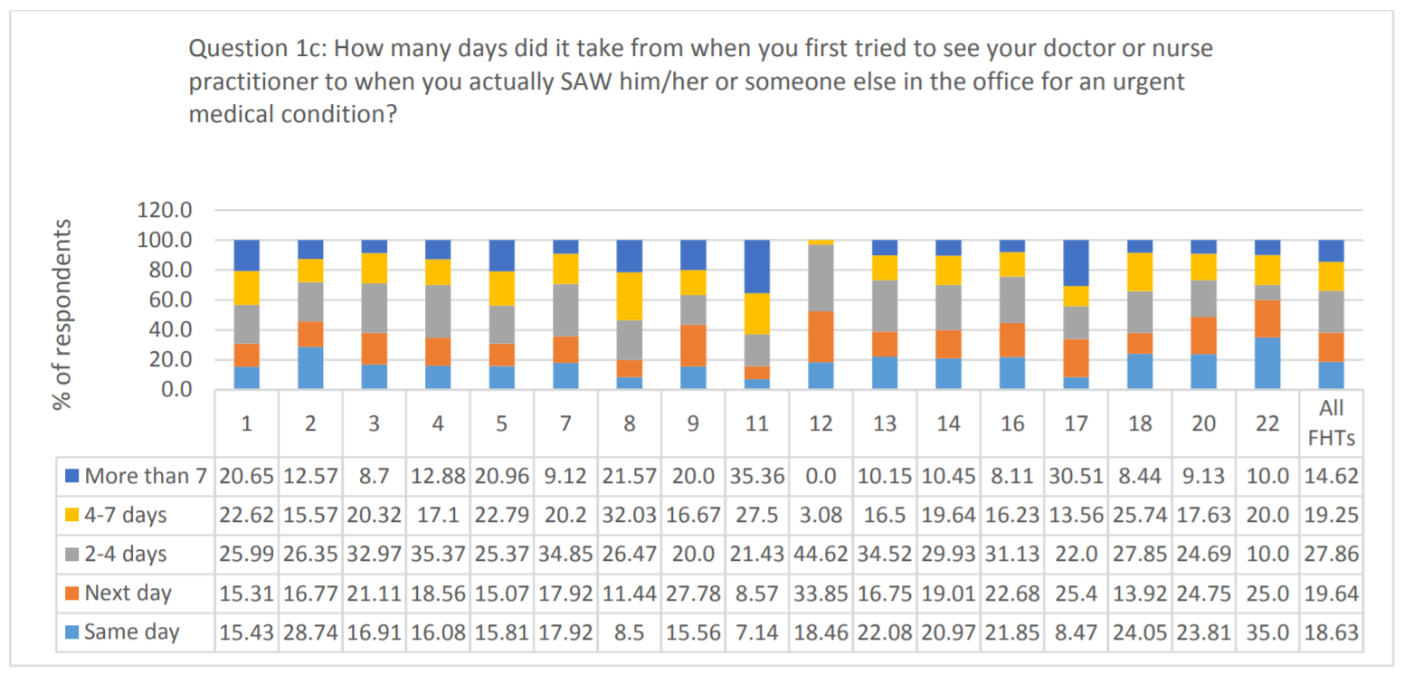
Initially, in the original report, data in was presented as a series of bar charts, each chart displaying the results from all participating FHTs. This worked fine for simple yes/no questions like this:

However, for other types of questions, the data in this format could be more difficult interpret:

My initial designs involved trying to make something similar to what the teams were used to receiving:
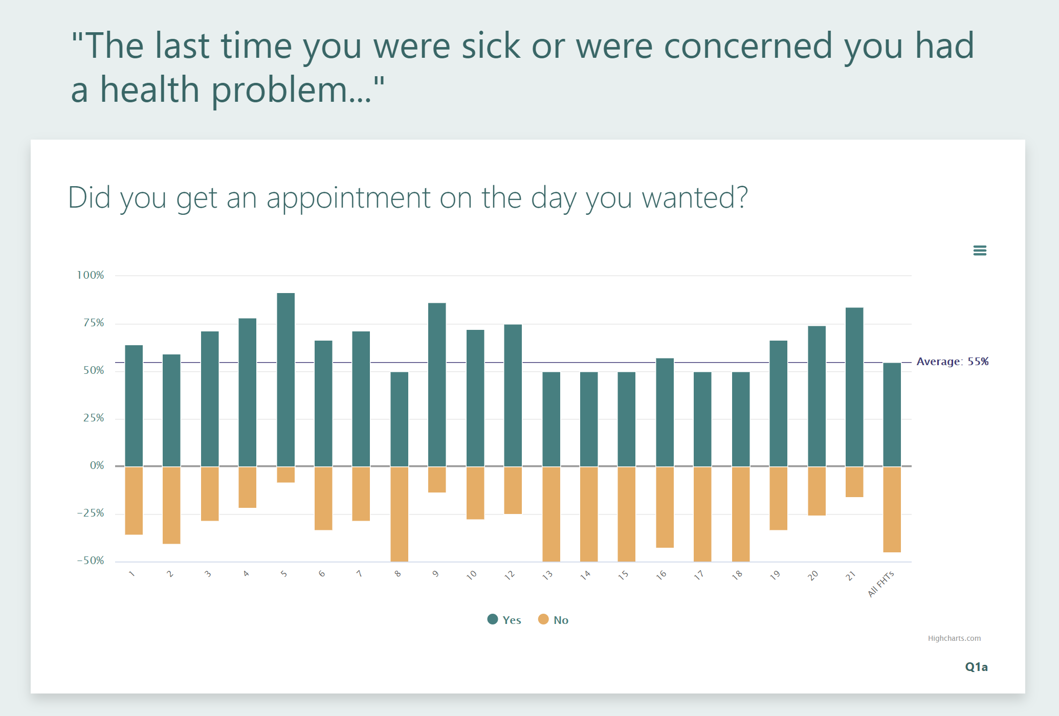
I showed the designs to a couple of stakeholders and got good feedback. They seemed very happy with the presentation of the data, but I still didn’t think that it was the cleanest and most informative way to present the findings for some types of questions. Especially when it came to questions that would be best presented as a 100% stacked bar chart:

On to plan B ...
So, I made a new version where, instead of attempting to display all of the data at once, I centered the report on the FHT that would be viewing it. I plotted their score on a horizontal bar chart; the bar of the chart representing the range of scores from the other FHTs. I then added a point representing the average score across all FHTs. Finally, I added the option to display the individual scores from other teams along the bar.
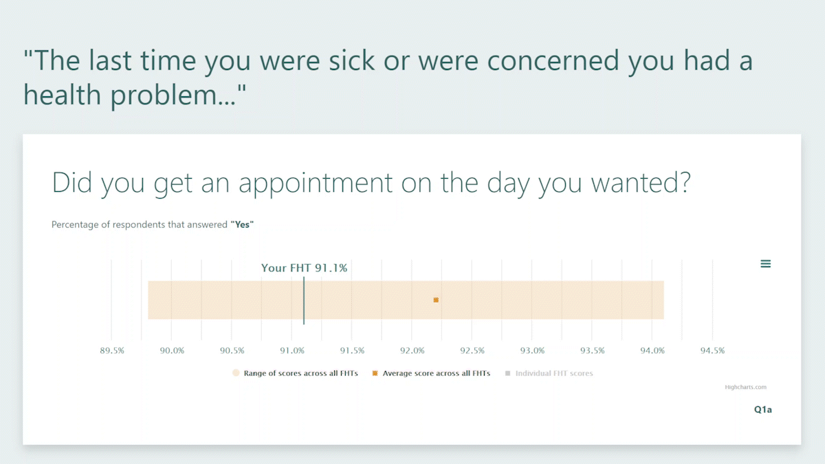
Using this layout, produced reports with clear, concise, easy to understand information, tailored to the specific FHT viewing it. It also provided a reusable layout for all of the questions, minimizing the effort needed to develop the final product.
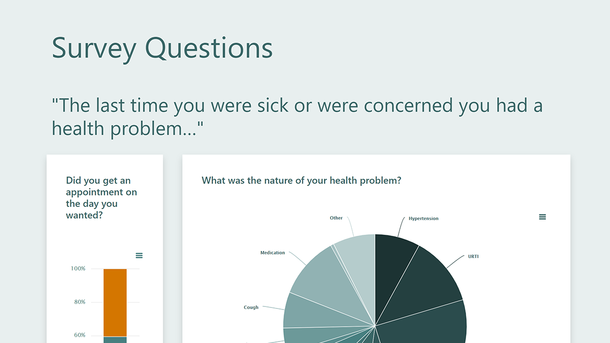
Here's a snippet of what the final Comparative Report layout looks like:

Clinic-Level and Provider-Level Reports
Since both the clinic-level and provider level reports that I designed are almost identical, I'll just talk about the design of the clinic-level report. The clinic-level report pulls together all of the data for a single FHT. Previously, there was no clinic-level report; for clinics that opted to have provider-level reporting, the reports looked like this:

I started my design, by creating a card layout for each type of question in the survey, using:
- horizontal bar charts for demographic data
- vertical bar charts for yes/no questions
- pie charts for multiple choice/multi answer questions
- diverging bar charts for Likert scale questions (placing 'neutral' on the negative side, to be consistent with how the data was presented in past reports)
This provided a set of reusable layouts to build the report.
I then added a couple of extra card layouts so that related information could be viewed together:
- a population pyramid, combining age, sex, and language data
- a layout containing multiple pie charts, combining appointment wait time with nature of health problem
Here's a snippet of what the final Clinic Report layout looks like:
