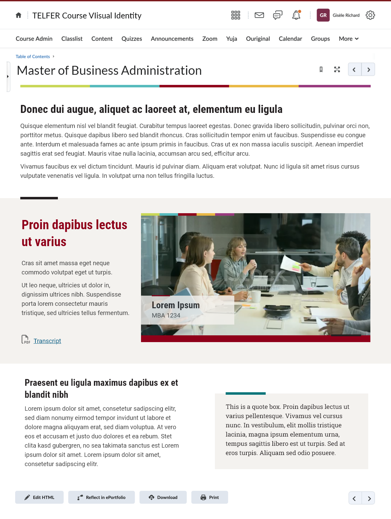
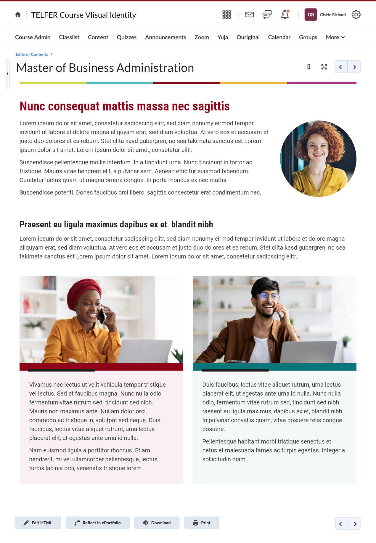
Creating a UI kit for course development ensures a consistent look and feel across multiple courses being offered as part of a program. It supports the branding of the organisation or faculty offering the course and gives the final courses a professional and credible look. It ensures that when a student progresses and moves from course to course, the course components and controls look and function in the same way.
Creating a colour palette is one of the first steps we took in creating the UI kit for the Telfer French MBA program. The client wanted to include the university colours and typefaces. We explained the need for an extended colour palette to be used in charts and diagrams, and some components to help support learners to differentiate between different concepts, or to group certain concepts together.
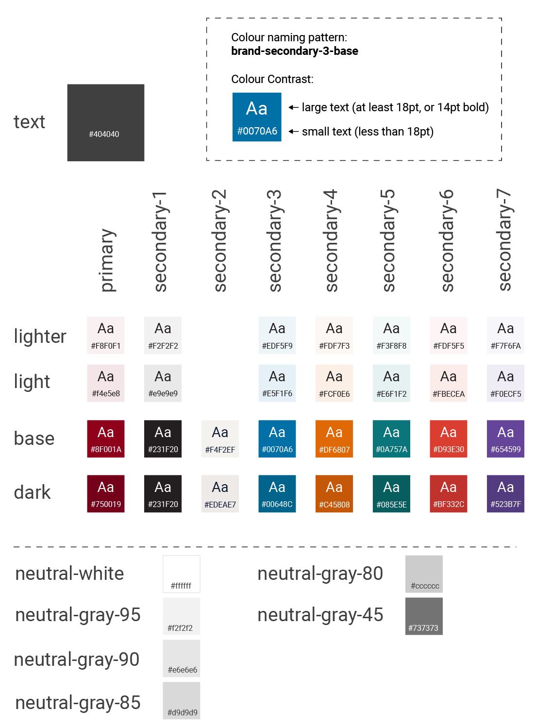
The next step was to design some components to be used to present the course content. Since we have worked on courses for other programs/faculties, we know that there are certain layouts that are used frequently, for example accordions, tabs, highlight boxes, and cards. We prepped a mock-up in Adobe XD to show the client, with the colour palette and some layouts that we see frequently in course design.
Once the mock-ups were approved by the client, we refined our designs and began to build a development kit. The development kit helps us to program our courses faster and keep a consistent look and feel.
The development kit consists of pre-programmed components or blocks of code that can be copied and pasted into an HTML course page. I based everything in the kit off one of our previous kits, updating the colours, typography, and branding, in addition to making some improvements in functionality and accessibility.
The following images are a screen capture of the entire development after I had created it in HTML and uploaded it to Brightspace.


Each time we make a new UI kit for a set of courses, I look at ways to improve useability and accessibility. Here are a few of the improvements that I made for this kit:
Increased the clickable area for accordions and added a darker hover state colour.
The previous version:
The new version:
These two changes make it easier to click an accordion and gives a more obvious visual feedback to the user that their cursor is over the correct area to expand the accordion.
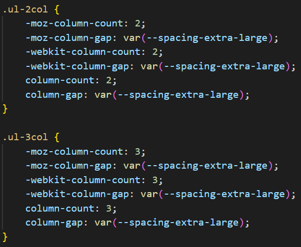
Created new accessible multi-column list layouts.
I created these new layouts to help with screen reader accessibility. To condense information on a page sometimes we will ask the developers to put lists in columns. To make a multi-column list appear as a single list to screen readers, I added some CSS that divides the list over two or three columns and automatically balances the number of list items across those columns.
Previously, if a list were manually divided across columns, each containing a portion of the list, the screen reader would have read it as separate lists.
Corrected tabbing behaviour for flip cards.
While testing our flip cards I found that tabbing from card to card was confusing. It turned out that you could tab to the button on the backside of a card. In this example, it took 7 tab key presses to get to the fourth card.
I corrected this for the new UI kit. I ensured that the side of the flip card that is not currently visible is not accessible to keyboards.
Added aria-live to components that show new information when clicked.
To improve usability for people using screen readers, I added aria-live to elements that appear after a user clicks on a button. This includes interactive graphics, click to reveal layouts, and feedback on question/answer components.